
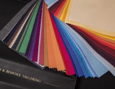
In the fashion industry, colours play a significant and often, even the most important role in the choice of fabrics – both in women’s and men’s wardrobe. These days are characterized by a very large variety of trends and their rapid changes – sometimes by returning to the classics and traditions, and sometimes by very original and controversial solutions. We know this perfectly. Therefore, while creating a new collection, we pay special attention to the selection of colours, enriching our offer each year with dozens of new colours. As in the case of naming our fabrics, also the colour naming is based on the scheme we developed.
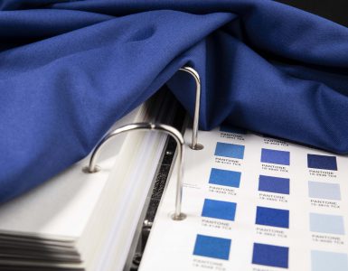
Our colour palette is associated with the Pantone colour classification system. It is one of the most famous and popular palettes among designers and graphic specialists from around the world. This company has developed The Pantone Colour Matching System, which is a standardized colour mapping system that has a unique number and a suffix designating a type of the fabric tested – cotton fabric or paper. At JÓŹWIAK Poznań, we use the Fashion Home + Interior Color Guide palette, a scale in the Cotton version created for the needs of textile industry, the colour markings of which are marked with a prefix TCX, and the colour samplers are printed on cotton.
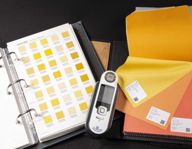
Such a well-developed and widely known color palette is an indispensable tool for us in the process of designing new patterns, and it is also an incredible help in communication with the client. Thanks to this, by cooperating with the client remotely over a given fabric pattern, we are able to determine the colors very accurately. For this purpose, in addition to the template, we also use a special Pantone device that is used to identify colors very precisely.
Names of the colours of our fabrics come from well-known bases and colour dictionaries around the world. Based on them, we were able to build a unique colour naming convention. Before giving a name, the colour on the fabric is examined by us using the device and checked with the Pantone palette. In addition, each of our colours is referentially related to the TCX colour.
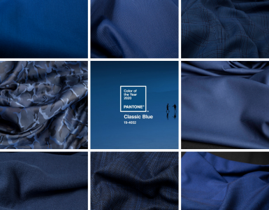
The Colour Pantone Institute has published a colour of the year for over twenty years. The colour has just been announced for the upcoming year of 2020. After the brave, bright colours chosen in 2019 and 2020, the time has come for a slightly more subdued colour scheme. According to the Pantone, an elegant cold shade of blue described by the Pantone as Classic Blue PANTONE 19-4052, will reign over the upcoming year. We liked this colour very much, especially considering that very similar shades of blue have long been quite a significant group in our catalogues.